Showing posts with label Sketch Definations. Show all posts

what is an ambigram

 Ambrigam : Web definitions
  • An ambigram is a typographical design or artform that may be read as one or more words not only in its form as presented, but also from another viewpoint, direction, or orientation. ...


  • A design that may be read as the same word or phrase (or sometimes two different words or phrases) when oriented in two different ways, usually when reflected in a vertical axis or when rotated through 180 degrees


  • a word, phrase, or sentence written in such a way that it reads the same way upside down as right side up.


  • These are words that, when flipped upside down, legibly spell either the same or a completely different word.  The ClueMaster frequently uses Ambigrams as clues.

Why drawing?

Drawing as a medium through which to investigate creative thinking is pertinent because of the immediacy of the activity – there is little in the medium that intervenes between the artist and the marks that are made. I read that, ‘drawings are seen as a unique form of access to the thoughts of the people who make them. Indeed they are simply treated as thoughts’ (Wigley in De Zegher & Wigley 2001: 29).

There appears to be a consensus amongst commentators that ‘drawing turns the creative mind to expose its workings’ (Hill 1966: 4). Some define the activity as a cognitive tool to facilitate and assimilate information (Tversky 1999). Others interpret drawing more personally as being akin to the conflict between signature and outcome of intelligence (Godfrey 1980; Chhatralia in Kingston 2003). Yet others emphasise how drawing plays a developmental role in the process of thinking through ‘an interplay between the functions of seeing and knowing’ (Rawson 1979: 7). Whilst many of these were the views of practitioners, they were still in effect the opinions of others. I was left wondering how I might have some understanding of these findings for myself, and began by reviewing a number of contemporary theoretical assumptions about the drawing/thinking relationship.


Style and thinking

Perhaps the most easily assumed visual connection between drawing and thinking is the possibility that a drawing’s style can reveal the nature of the thinking processes that made it. In other words, style is analogous to mode of thinking and, by extension, its purpose (Thompson 1969).

It is often assumed that cool or analytical drawings which are linear, hard-edged and precise in their mark-making are the outcome of pre-determined and conventional cognitive processes (Rawson 1969; Thompson 1969). The plan section and elevation drawings used in the architectural process rely on their ability to operate like a language that is understood by a wide range of disciplines. Warm or intuitive drawings on the other hand suggest informal, gestural and experimental attitudes to mark-making. They appear to involve processes with no a priori or forward-thinking cognitive strategy, where aims are revealed only on completion of the drawing (Perry 1992).

These assumptions have been challenged on the basis that their use very much depends upon the social and cultural context in which drawing is used (Robbins 1994). I also noticed how a variety of practitioners often use drawing styles out of context; in fact, some practitioners actively play with these assumptions. I investigated the grey area in which architects such as Kiesler rely on a range of non-technical drawing conventions for conceptual architectural projects, and where artists such as Paterson  explore technical drawing conventions more traditionally associated with architectural drawings to make social comments.

However, this idea fails to take into account how, in practice, ideas often appear to emerge as the activity progresses. I began to question whether it was actually possible to carry out a totally pre-determined drawing without the process of making it changing one’s plans as one went along. Could it be the case that the act of making would always interfere to change one’s intentional or logical reasoning?

what is logo?

A Logo is a design symbolizing ones organization. It is a design that is used by an organization for its letterhead, advertising material, and signs as an emblem by which the organization can easily be recognized, also called logotype. Logotype is a graphic representation or symbol of a company name, trademark, abbreviation, etc., often uniquely designed for ready recognition.
source: logobee

A logo is a graphic mark or emblem commonly used by commercial enterprises, organizations and even individuals to aid and promote instant public recognition. Logos are either purely graphic (symbols/icons) or are composed of the name of the organization (a logotype or wordmark). An example of an abstract mark is the blue octagon representing Chase Bank, while an example of a representational mark is the "everyman" icon of PBS. Examples of well-known logotypes (wordmarks) are the striped IBM design, Mobil written in blue with a red "o" and CocaCola written in flowing red script.
source: wikipedia

Logo graphic design is one of the most challenging areas of graphics design. Logos can be tricky. They are often the defining feature of a company. The public face, if you will. Good research and patience are key to any good logo graphic design.It's important to always know the specifics of what you or the client is looking for before you start. Generally for most projects.

Designing your own logo doesn’t have to be too hard as long as you have some guidelines to stick to, some decent software, a huge portion of creativity and a few hours to spare.


Art direction as a presentation

 One way to understand the mechanics of art direction is to use another analogy; that of a personal presentation or pitch, whereby you the presenter are trying to sell an idea or concept to another person or a group of people. This needn’t be an advertising pitch. It could just as easily be an idea for a new invention, or a business venture that you’re trying to get someone to buy or invest in.

As a presenter, you have an opportunity to use the face-to-face encounter to show and demonstrate what you have to offer. In such cases, the success or failure of your pitch is often determined not just by the quality of your idea, but also by the way in which you present it; including aspects such as your pace of delivery, the order and sequence of information, body language, confidence, attitude and sometimes the quality of your dramatic performance.

Now let’s make the comparison with art direction. Having a great advertising idea for selling a product is essential, but first you have to grab your audience’s attention, and generate their interest or desire in your product. Art direction plays a major role, using drama, intrigue, suspense, tension, surprise or revelation to achieve the desired effect and help sell the idea. In essence, the manner in which you art direct your advert is the visual presentation of the advertising message.

how art direction works

Having taken a look at what exactly art direction is, it’s worth briefly examining how art direction works, before tackling this in more detail in the chapters that follow. A good place to start is by looking at David Christensen’s analogy of art direction as a ‘window’.

Just as a window is essentially a transparent medium that enables us to view things on the other side of it, good art direction enables us to see or understand the advertising message more clearly. It’s all about clarity, and nothing that the art director adds should hinder, obstruct, or get in the way of that message.

In this sense, the window in question is of course a clear pane, not a stained-glass affair. It’s often tempting to start showing-off with clever graphic tricks and design wizardry, but it’s essential to resist the temptation and always remember that ‘less is more’… a theme that we’ll be returning to in detail later....

digital image processing

A digital remotely sensed image is typically composed of picture elements (pixels) located at the intersection of each row i and column j in each K bands of imagery. Associated with each pixel is a number known as Digital Number (DN) or Brightness Value (BV), that depicts the average radiance of a relatively mall area within a scene (picture below). A smaller number indicates low average radiance from the area and the high number is an indicator of high radiant properties of the area. The size of this area effects the reproduction of details within the scene. As pixel size is reduced more scene detail is presented in digital representation.

Structure of a Digital Image and Multispectral Image

According wikipedia Digital image processing is the use of computer algorithms to perform image processing on digital images. As a subcategory or field of digital signal processing, digital image processing has many advantages over analog image processing. It allows a much wider range of algorithms to be applied to the input data and can avoid problems such as the build-up of noise and signal distortion during processing. Since images are defined over two dimensions (perhaps more) digital image processing may be modeled in the form of Multidimensiona.

History

Many of the techniques of digital image processing, or digital picture processing as it often was called, were developed in the 1960s at the Jet Propulsion Laboratory, Massachusetts Institute of Technology, Bell Laboratories, University of Maryland, and a few other research facilities, with application to satellite imagery, wire-photo standards conversion, medical imaging, videophone, character recognition, and photograph enhancement. The cost of processing was fairly high, however, with the computing equipment of that era. That changed in the 1970s, when digital image processing proliferated as cheaper computers and dedicated hardware became available. Images then could be processed in real time, for some dedicated problems such as television standards conversion. As general-purpose computers became faster, they started to take over the role of dedicated hardware for all but the most specialized and compute-intensive operations.
With the fast computers and signal processors available in the 2000s, digital image processing has become the most common form of image processing and generally, is used because it is not only the most versatile method, but also the cheapest.
Digital image processing technology for medical applications was inducted into the Space Foundation Space Technology Hall of Fame in 1994.

COLOR COMPOSITES
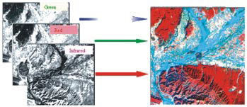
While displaying the different bands of a multispectral data set, images obtained in different bands are displayed in image planes (other than their own) the color composite is regarded as False Color Composite (FCC). High spectral resolution is important when producing color components. For a true color composite an image data used in red, green and blue spectral region must be assigned bits of red, green and blue image processor frame buffer memory. A color infrared composite ‘standard false color composite’ is displayed by placing the infrared, red, green in the red, green and blue frame buffer memory (picture below). In this healthy vegetation shows up in shades of red because vegetation absorbs most of green and red energy but reflects
approximately half of incident Infrared energy. Urban areas reflect equal portions of NIR, R & G, and therefore they appear as steel grey.
 False Color Composite (FCC) of IRS : LISS II Poanta area

Basics of Character Design

Today i'm write about creating characters and bringing them to life. Character creation includes a number of technical tasks, such as modeling, texturing, and rigging, all of which will be covered later. Before you start building a character, however, you'll need to design it.


Design is about making choices, both artistic and technical. It means getting to know your character's personality and then making choices that communicate this personality visually. When designing, you need to make decisions about size, shape, color, texture, clothing, and many other attributes. There is also a technical aspect to character design: well-designed characters are easy to animate, making the animator's job easier and more creative.
Good character design is one of the cornerstones of good animation. Designing your characters properly will make their personalities jump off the screen. Your audience will know who your characters are immediatelyand like them. When you pair a great design with a great personality, the results can be wonderful.

What is "Contemporary" Art?


This is an excellent question, and one that isn't asked often enough. Presumably, this is another one of those art definitions we are all supposed to know - most likely by osmosis, or some other telepathic means, because (heaven forbid) you wouldn't want to ask a "stupid" question at some Art World function. (Well, you might, but I wouldn't. At least, not ever again.)

Anyway, the answer is divinely simple. Contemporary just means "art that has been and continues to be created during our lifetimes". In other words, contemporary to us.

Now, of course, if you are 96-years old and reading this (By the way, congratulations, if this describes you. Way to keep up with the times!), you can expect a certain amount of overlapping between "Contemporary" and "Modern" art in your lifetime. A good rule of thumb is:

* Modern Art: Art from the Impressionists (say, around 1880) up until the 1960's or 70's.
* Contemporary Art: Art from the 1960's or 70's up until this very minute.

Here at About Art History, 1970 is the cut-off point for two reasons. First, because it was around 1970 that the terms "Postmodern" and "Postmodernism" popped up - meaning, we must assume, that the Art World had had its fill of Modern Art starting right then.

Secondly, 1970 seems to be the last bastion of easily classified artistic movements. If you look at the outline of Modern Art, and compare it to the outline of Contemporary Art, you'll quickly notice that there are far more entries on the former page. This, in spite of the fact that Contemporary Art enjoys far more working artists making far more art. (It may be that Contemporary artists are mostly working in "movements" that cannot be classified, due to there being around ten artists in any given "movement", none of which have shot off an email saying that there's a new "movement" and "could you please tell others?")

On a more serious note, while it may be hard to classify emergent movements, Contemporary art - collectively - is much more socially conscious than any previous era has been. A whole lot of art from the last 30 years has been connected with one issue or another: feminism, multiculturalism, globalization, bio-engineering and AIDS awareness all come readily to mind as subject matter.

So, there you have it. Contemporary art runs from (roughly) 1970 until now. We won't have to worry about shifting an arbitrary point on the art timeline for another decade, at least. Go, be of good cheer, and fear not the term "Contemporary Art".

What is "Modern" Art?

Please know that this is a good question. We are contemporary to modern times. No one should be sneered at for not knowing that The Art World has its own separate definitions for each of these terms. In any other instance, the English language pretty much allows for "modern" and "contemporary" to be swapped at will.

As you have doubtless guessed, the single most important thing anyone needs to know about Modern Art is that it'sdifferent from Contemporary Art.

A good rule of thumb is:

* Modern Art: Art from the Impressionists (say, around 1880) up until the 1960's or 70's.
* Contemporary Art: Art from the 1960's or 70's up until this very minute.

Here at About Art History, Modern Art starts as the Impressionists were winding down. While this is acceptable,strong arguments can be (and have been) made that Modern Art began at a variety of different dates. Depending onwhich survey course a person takes, Modern Art is said to have begun with:

* Romanticism, in the early 1800's,
* Realism, in the 1830's,
* Daguerre's announcement, in 1839, that he had invented a method for making a direct positive image,
* The writer Baudelaire who, in 1846, called upon artists to "be of their time",
* The first Impressionist show in 1874 or
* The "-isms" of the 1880's (Tonal-, Symbol-, Post-Impression- and Neo-Impression-)

Which one is right? Well, none of them are "wrong". (Here, it was simply a case of "1880" working out well, for me,in terms of organization.) For simplicity's sake, let's just say that Modern Art began in the 19th-century, and ranthrough a whole slew of "-isms" up until the end of the 1960's.

Regardless of chosen starting date, the crucial factor is that Modern Art means: "The point at which artists :
1) felt free to trust their inner visions,
2) express those visions in their work,
3) use Real Life (social issues and images from modern life) as a source of subject matter and
4) experiment and innovate as often as possible."

Wordy, I know! Art is kind of messy that way. It's often easier to make it, than to try to explain it - and making it can be about as easy as childbirth, some days. But that's Modern Art (and Modern Life) for you. Say, now that you're positive of the meaning, why not go have some fun poking around in all of those delicious "-isms"?

Fashion Sketch

Fashion has its own language. Utter no word and listen to your wardrobe you will hear the whispers of those scarves, those gowns, those broad hats, those stilettos and those fashion accessories that murmur the saga of dreams that gradually turned into reality. Quite eminentlytherefore fashion is simply not just those linens and silks, those shoes and slip-ons but is a dream which begins there at the mind of the designers and then finds expression amidst those million fashion items.

Between the imagination of the designers and the “landing strip” there are many months’ hard work and those countless amount of scribbles’ in order to attain that ideal “fashion sketch”

Fashion sketch is definitely one of the most important parts of fashion designing. Also known as “illustrations” fashion sketches are more than mere outlines of human figures.

With those few lines, with those imaginary silhouettes fashion sketch is as if a gestation of an idea, as if the gradual growth of dream! Thousands of designers spends hours after hours in order to make that perfect fashion sketch which is of course the corner stone for making those apparels which have raised brows of the fashion freaks with its shades, color, pattern and style.

What best can illustrate the designers’ dream than the details of fashion sketches? What best can take fashion to the further level of sheer mellowness than those myriad hours of sheer detailing of the fashion sketches which has actually delineated the very idea of “fashion” and style over and over again? The fashion sketches are just the basics and it is indeed not necessary to implement the whole sketch in totality whilst designing particular apparel.

Some details of the fashion sketch often makes that “final cut” while sometime designers abandon a particular part in some point of the final creation process. Often the designers tend to keep the final product quite similar to the fashion sketches.

Again sometimes the very voyage from the sketches to clothing makes the end product pretty much unrecognizable, where it is the very vision, concept, dream and creativity of the fashion designers which finds an articulate expression amidst his finale designs.

what is poster?

Placard redirects here: this should not be confused with Plaque or Plack
For other uses of the word 'poster', see poster (disambiguation)
“Moulin Rouge - La Goulue.” (1891) Poster by Toulouse-Lautrec.

A poster is any piece of printed paper designed to be attached to a wall or vertical surface. Typically posters include both textual and graphic elements, although a poster may be either wholly graphical or wholly textual. Posters are designed to be both eye-catching and convey information. Posters may be used for many purposes, and they are a frequent tool of advertisers (particularly of events, musicians and films), propagandists, protestors and other groups trying to communicate a message. Posters are also used for reproductions of artwork, particularly famous works, and are generally low-cost compared to original artwork. Another type of poster are educational posters, which may be about a particular subject for educational purposes. Many people also collect posters, and some famous posters have themselves become quite valuable, collectors and vintage posters are usually framed and matted. Posters may be any size.

refferer:http://en.wikipedia.org/wiki/Poster

Introduction
A poster is an informative, often decorative way to attract attention to the information it contains. Here are some ways to use posters in a literacy program:

* To advertise events or products
* To display information or instructions
* To teach some kinds of information

Definition
A poster is a bill or placard usually displayed in a public place. It is often decorated with designs or illustrations.
Kinds

Here are some kinds of posters:
*Posters you make yourself.
*Ready-made posters from
-business organizations
-community development organizations
-government offices
-medical companies, or
-tourist agencies.
Tip: Glue local language text over the original text if local language posters are unavailable.

refferer: http://www.sil.org/lingualinks/literacy/ReferenceMaterials/


Unique Calligraphic (khat writing) Collections

The development of Arabic calligraphy led to the creation of several decorative styles that were designed to accommodate special needs or tastes and to please or impress others. The most outstanding of these techniques or scripts are Gulzar, Maraya or Muthanna, Zoomorphic, Siyaqat, and al-Khat al-Hurr.

Gulzar:
Gulzar is defined by Safadi (1979) in Islamic Calligraphy as the technique of filling the area within the outlines of relatively large letters with various ornamental devices, including floral designs, geometric patterns, hunting scenes, portraits, small script, and other motifs. Gulzar is often used in composite calligraphy where it is also surrounded by other decorative units and calligraphic panels.A Persian piece in "gulzar" calligraphy from the later 1800s "Iran, second half of the 19th century. Ink, gouache and varnish on cardboard. 12 1/2 x 18 1/4 in. Private collection. Falk (1985), 179, p. 192.

The beauty of the Arabic alphabet is entirely intrinsic. It can be appreciated for its formal and rhythmic qualities alone and needs no embellishment or decoration. But both Iranian and Ottoman tastes, particularly in the 19th century, put the Arabic alphabet through some strange contortions. Scripts were covered with representations of people, animals and even tiny scenes.

This script is called Gulzar, meaning "full of flowers." A good example can be seen here. It is part of a verse by the Persian poet Hafiz and says:

"We came this way searching for glory and power."

The script is decorated with animals, people and landscape in a griasille technique on a plain background. In his original verse, however, Hafiz wrote the opposite: "We did not come..."

The origins of Gulzar script are perhaps to be found in a technique known from the 16th century at least, whereby phrase such as the basmalah was filled with minutely written Qur'anic verses. Gulzar in the form shown here seems to have been practiced since the 17th century. There is a piece in the Chester Beatty Library, Dublin (Ms 11A:3) bearing the name of the Mughal Emperor Shah Jahan."

Maraya or Muthanna:
Maraya or Muthanna is the technique of mirror writing in which the composition on the left reflects the composition on the right.

Zoomorphic:
In zoomorphic calligraphy, the words are manipulated and structured into the shape of a human figure, a bird, an animal, or an object. Safadi notes that Thuluth, Naskh, and Nasta'liq scripts are extensively applied to create such calligraphic compositions.

Tughra:
Tughra is a unique calligraphic device that is used as a royal seal. The nishanghi or tughrakesh is the only scribe specialized in writing Tughra. The emblems became quite ornate and were particularly favored by Ottoman officialdom.

Siyaqat:
Siyaqat is another style developed and favored by the Ottomans; it was used in chancelleries and courts. Siyaqat has a close affinity with Kufic script where the lines are straight and heavy and relatively angular.

al-Khat al-Hurr:
Al-Khat al-Hurr may be the most modern calligraphic script and was developed in different parts of the Arab world in the 1980s. This free-style script does not follow a pre-set pattern but typically is elegant and highly stylized. It is excessively cursive, and the curves display marked contrast in line width. A curve might change abruptly from the heaviest possible line a pen can create to thethinnest possible line from the same pen.


refferer:
http://bishratiric.com
http://www.ellimo.com
http://www.persiancalligraphy.org
http://callidesign.blogspot.com

What is the main difference between caricature and portrait?

The key difference between caricature and a portrait of someone is the intentional
distortion of the subject in caricature. This distortion is difficult because the features of the subject are what makes the subject recognizable, when you start fooling around with these features, then you run the risk of loosing the likeness of the subject.

The caricatures and cartoons are considered the same thing. The difference between the two is a caricature is simply a cartoon of someone or something that the viewer can recognize as a specific someone or something. As soon as someone known by the viewer is seen in a cartoon, it becomes a caricature.


Today, the art of caricature is still around, though nowhere near as prevalent as the "Golden Age" of the 20's and 30's. In recent years there has been a rise of amateur "On-the-spot Caricaturists" who can be found on street corners or fairs and will draw a quick sketch of anyone willing to pay their fee. The word "caricature" can also apply to a person or thing that displays behaviour or mannerisms that are ridiculously exaggerated and overly stereotypical.

refferer:
http://www.mystudio69.com
http://drawface.blogspot.com
http://drawingstudio.blogspot.com
http://myfreesketch.blogspot.com
http://sketchpercuma.blogspot.com

What is Caricature ?

A caricature is either a portrait that exaggerates or distorts the essence of a person or thing to create an easily identifiable visual likeness, or in literature, a description of a person using exaggeration of some characteristics and oversimplification of others.


There are three main features of any caricature:
1. Exaggerated emphasis on ugliness, hideousness, meanness, etc.
2. Highlighting of unnatural abnormalities are allowed within certain limits.
3. Any caricature should have some resemblance to a human being even if it does not represent a person.

Around the world us are shown by a caricaturist from unexpected and witty point of view. The level of its witticism reflects , by its own way, the spiritual and intellectual life of the definite people, society, and epoch. Any caricature is the way of thinking, an illustration of the time; it can be created only in developed society, because only sound, healthy, and strong people can laugh at themselves.

At the same time a caricature can be a complicated code, a kind of Aesopian language. A caricature can be evil and kind, sharply satirical and humorous. Humour is neither a sermonizing preacher nor a garbage collector, although these activities are always attributed to it. To understand the caricaturist's idea, one should have at least a bit of sense of humour, be ready to smile, to laugh. The difference between any animal and a human being is the human sense of humour.


refferer:
http://en.wikipedia.org
http://www.google.com.my/search

Introduction To Batik

Batik is a wax resist fiber art. Hot wax is applied to fabric in a design. The wax serves as a resist, preventing the dye from reaching the fabric where it was applied. This technique can be applied in layers with different colors.
The Batik effect is unique in that the wax cracks during handling, either intentionally or not. In each dye bath, the cracks in the wax allow the dye to reach the fabric creating the unique batik effect . Batik can be done on cottons, silks and other natural fabrics. "Faux" batik employs other types of resists, particularly water soluble ones, that are easier to remove than wax, but never quite achieve the same beautiful crackling. Dharma Procion MX Fiber Reactive Dyes are the dye of choice for batik on cotton because they are used with cold water.

Batik masters employ the process of repeated waxing and tub dyeing to achieve their final result. This method involves an understanding of color mixing and overdyeing, as each layer of dye is applied over the last, producing a new color. After many different applications, the background tends towards dark brown, black or grey. The waxed areas remain the lighter shades produced by each individual dye application and combinations thereof.

learn more at :
1. Waxing and Immersion Method
http://www.dharmatrading.com/info/batik.html

2.Dyes
http://www.dharmatrading.com/procion.html

What is Batik?

This article is about the painting and textile dyeing technique, for other uses see Batik
disambiguation).
Batik (pronunciation: ['ba.te?], but often, in English, is ['bæ.t?k] or [b?'ti?k]) is a wax-resist dyeing technique used on textile. Batik is considered as national art in Indonesia. However, similar patterns like Batik is also found in several countries of West Africa, such as Nigeria, Ghana, Cameroon, Uganda and Mali, and in Asia, such as India, Sri Lanka, Bangladesh, Iran, Philippines, Malaysia, Thailand and Burma.

Batik is a fabric dying method using wax to create patterns and designs.This method makes use of a resist technique; applying areas of cloth with wax (a dye-resistant substance) to prevent them from absorbing colors when the cloth is dipped into dye.Not only as a dye-resistant substance, the wax applied is also used to control colors from spreading out from a particular area to create motif when the dye is painted.
Color Batik a method thought to be over a thousand years old, today, batik has taken on a much wider meaning. It can be referred to:
1.cloth block printed with wax or
2.cloth decorated with hand-drawn designs.
3.cloth decorated with traditional batik designs without the use of the resist method.

The use of batik has also extended from clothing to everything from home furnishings and table cloths to handicrafts.

In Malaysia, batik has become a national identity and flourish in the arena of fashion where batik attire is worn for both formal and informal occasions.When Malaysia hosted the Asia Pacific Economic Cooperation forum (APEC) in 1998, leaders showed up to proceedings decked in floral and swirling trade marked batik patterns.

refferer:
http://en.wikipedia.org/wiki/Batik
http://www.google.com.my/search

what is The Sculpture

Sculpture is three-dimensional artwork created by shaping or combining hard and or plastic material, sound, and or text and or light, commonly stone (either rock or marble), metal, glass, or wood. Some sculptures are created directly by finding or carving; others are assembled, built up and fired, welded, molded, or cast. Sculptures are often painted. A person who creates sculptures is called a sculptor.

Because sculpture involves the use of materials that can be moulded or modulated, it is considered one of the plastic arts. The majority of public art is sculpture. Many sculptures together in a garden setting may be referred to as a sculpture garden.

Types of sculpture

Some common forms of sculpture are:

1.Free-standing sculpture, sculpture that is surrounded on all sides, except the base, by space. It is also known as sculpture "in the round", and is meant to be viewed from any angle.
2.Sound sculpture
3.Light sculpture
4.Jewellery
5.Relief - the sculpture is still attached to a background; types are bas-relief, alto-relievo, and sunken-relief
6.Site-specific art
7.Kinetic sculpture
- involves aspects of physical motion
- Fountain - the sculpture is designed with moving water
- Mobile (see also Calder's Stabiles.)
8.Statue
- representationalist sculpture depicting a specific entity, usually a person, event, animal or object
- Bust - representation of a person from the chest up
- Equestrian statue - typically showing a significant person on horseback
9.Stacked art - a form of sculpture formed by assembling objects and 'stacking' them


Materials of sculpture through history

Sculptors have generally sought to produce works of art that are as permanent as possible, working in durable and frequently expensive materials such as bronze and stone: marble, limestone, porphyry, and granite. More rarely, precious materials such as gold, silver, jade, and ivory were used for chryselephantine works. More common and less expensive materials were used for sculpture for wider consumption, including glass, hardwoods (such as oak,box/boxwood, and lime/linden); terra cotta and other ceramics, and cast metals such as pewter and zinc (spelter).

Sculptures are often painted, but commonly loose their paint to time, or restorers. Many different painting techniques have been used in making sculpture, including tempera, [oil painting], gilding, house paint, aerosol, enamel and sandblasting.

Many sculptors seek new ways and materials to make art. Jim Gary used stained glass and automobile parts, tools, machine parts, and hardware. One of Pablo Picasso's most famous sculptures included bicycle parts. Alexander Calder and other modernists made spectacular use of painted steel. Since the 1960s, acrylics and other plastics have been used as well. Andy Goldsworthy makes his unusually ephemeral sculptures from almost entirely natural materials in natural settings. Some sculpture, such as ice sculpture, sand sculpture, and gas sculpture, is deliberately short-lived.

Sculptors often build small preliminary works called maquettes of ephemeral materials such as plaster of Paris, wax, clay, or plasticine, as Alfred Gilbert did for 'Eros' at Piccadilly Circus, London. In Retroarchaeology, these materials are generally the end product.

Sculptors sometimes use found objects.

references about sculpture at :http://en.wikipedia.org

The Effects and Moods of Color

The Effects and Moods of Color:

The colors of 'Cold': Colors like Blue, green and Blue-green are associated with cold, and calm. Use these colors to promote a feeling of austerity, cleanliness, invigorating freshness, coldness.
The colors of 'Cool': Blue is the base for these colors but added are reds and yellows to bring out a wide range of color from minty green to a soft violet. These colors help promote a feeling of calm, serenity, trust and relaxation.

The colors of 'Hot': Red is the highest chroma color there is...simply put it is the most powerful hue. A hot color may evoke strong emotional responses, and has been known to stimulate physical activity and sexual desire. Use hot colors if you are wanting an aggressive feel or want something to really stand out amongst others. Note: Even though red is the strongest of hues, placing a high chroma yellow in any designsd or work of art will draw the eye first.

The colors of 'Warmth': Based in Red but softened and suffused with orange and yellows. Warm colors are often used to suggest comfort and warm heartfelt emotions.

The colors of 'Darkness': No these are not the colors of evil. They are often used to reduce space. These colors are also used so that lighter colors can stand out greater and be more effective. These colors are somber, and can suggest melancholy and solidity.

The colors of 'Light': These colors are barely colors at all they exist merely as suggestions and hints of colors. They are the opposite of darkness, and they are often used to open up a space or evoke a feeling of openess.

The colors of 'Pastel': These pale colors are hues tinted with large amounts of white and are very soft in nature. The bring out a mood of innocence, fond memories, and romance.

The colors of 'Intensity': The colors of intensity are high chroma colors, pure and when used seem to scream their message. Great for attention grabbing.

The Color Schemes:

Achromatic: Achromatic schemes are made up of Black and Whites and the various range of neutral grays they produce. You can give achromatics a temperature by adding a small touch of another color.

Monochromatic: If you take a basic hue from the color wheel and use it and only its various tints and shades. The monochromatic scheme is usually a safe bet for pleasabilty factor. However it can often be the fall back scheme for designer and artists that are afraid to play with color.

Analoguos: An analoguous (say that 5 times fast) are three colors that are adjacent (side by side) on the color wheel. These colors are often harmonious and easy on the eye.

Primary:The playground colors. Made famous by such painters such as Mondrian (he rarely if ever used green in work), the Primary scheme is made up of a mixture of the Red, Blue and Yellow and is strong and energetic.

Secondary: The secondary scheme is made up of orange, green and violet. This scheme can aslo be energitic, and fresh.

Tertiary Triad: This ones a bit complicated and hard to conceptualize: but basically there are two schemes of three tertiary colors that are equidistant (Draw a equilateral triangle on the color wheel.) A basic Triadic scheme is when three colors are equidistant on the wheel.

references : http://www.tigercolor.com
download tiger color product :http://www.tigercolor.com/Download
find your color here: http://www.wellstyled.com
http://www.colorschemer.com
http://beta.dailycolorscheme.com
http://www.colourlovers.com

Color Theory

However much of the terminology and information can be used for both spectrums. I hope you find this useful.

Color Theory: As far back as man can recall, color has played an important part in communication, psycology and even physical health. Let's face it, color has power.Your choice of color whether it be for interior design, graphic design, or fine art, can set the mood, and effect the viewer in many way ways. Knowing how certain colors reach a particular target market or elicit a specific emotional response is important for the practicing designer or artist.

Color theory encompasses a multitude of definitions, concepts and design applications. All the information would fill several encyclopedias. As an introduction, here are a few basic concepts.

Let's Start with the Basics:

The color wheel - This very important and sometimes intimidating device is essential to designers and artists alike.
You will see why later in the discussion. (Colors are approximations only) The color wheel is made up of 12 basic hues. 3 Primary 3 Secondary (Mixture of 2 primaries) 6 Tertiary (Mixture of a primary and a secondary)

The Color Wheel
PRIMARY COLORS


Red, yellow and blue

In traditional color theory, these are the 3 pigment colors that can not be mixed or formed by any combination of other colors. All other colors are derived from these 3 hues
Red- emotional and active, danger, love, warmth, life
Blue- passive, soft, cool, watery
Yellow- warm, vibrant, the closest to light and warmth

SECONDARY COLORS


Green, orange and purple
These are the colors formed by mixing the primary colors.

TERTIARY COLORS


Yellow-orange, red-orange, red-purple, blue-purple, blue-green and yellow-green.
These are the colors formed by mixing a primary and a secondary color. That's why the hue is a two word name, such as blue-green, red-violet, and yellow-orange.

COLOR HARMONY

Harmony can be defined as a pleasing arrangement of parts, whether it be music, poetry, color, or even an ice cream sundae.In visual experiences, harmony is something that is pleasing to the eye. It engages the viewer and it creates an inner sense of order, a balance in the visual experience. When something is not harmonious, it's either boring or chaotic. At one extreme is a visual experience that is so bland that the viewer is not engaged. The human brain will reject under-stimulating information. At the other extreme is a visual experience that is so overdone, so chaotic that the viewer can't stand to look at it. The human brain rejects what it can not organize, what it can not understand. The visual task requires that we present a logical structure. Color harmony delivers visual interest and a sense of order.In summary, extreme unity leads to under-stimulation, extreme complexity leads to over-stimulation.

Harmony is a dynamic equilibrium.Some Formulas for Color Harmony.There are many theories for harmony. The following illustrations and descriptions present some basic formulas .

Some Color Terminology:


Hue
: The term hue is used to describe any pure color, with the exception of Black or White.
Chroma/Chromaticity: The chromaticity of a color is its saturation or intensity. For example if we are using an RGB palette a high chromaticity blue might be 0,0,255 or Red has a higher chromaticity than pink.
Value: The value of a color is its 'lightness' or 'brightness'. Now it might seem that chroma and value are the same thing but they are not. For example, if you take two high chroma colors like Blue and Yellow, Yellow has the higher value than blue because its 'brighter'.
Tone: A tone is any hue mixed with a grey (grey is a neutral of black and white)
Tint: A Tint is a hue mixed with white.
Shade: A shade is a hue mixed with black.
Complimentary Color: The color that is on the exact opposite side of the color wheel of one color. A neutral color is created when you mix these two colors together.

TIPS: When painting it is often better to use a color's compliment to darken an area of shadow rather than black. The reason being, it creates a richer more realistic shadow and when blacks are used in shadow they tend to 'flatten' them out.

references:
https://www.glidden.com
http://colormatters.blogspot.com

history of color

The world of natural color around us is enhanced by the use of dyes. Color is an expression of "feeling". Color can affect our emotions. The colors we surround ourselves with create certain feelings in us and for others, especially their perception of us. Commercial enterprises place great importance on their business image. Of priority is the choice of "company colors". Colors play an important role in our economy.

Colour has been investigated and used for more than 2000 years. Throughout history, different civilizations have experimented and learned more about colour. We are still learning today about how colour affects us and its importance in our lives.

Earliest Times of Colour

The ancient Egyptians have been recorded to have been using colour for cures and ailments. They worshipped the sun, knowing that without light there can be no life. They looked at nature and copied it in many aspects of their lives. The floors of their temples were often green - as the grass which then grew alongside their river, the Nile. Blue was a very important colour to the Egyptians too; the colour of the sky. They built temples for healing and used gems (crystals) through which the sunlight shone. They would have different rooms for different colours.

There are lists on papyrus dating back to 1550 BC of colour "cures".Their deep knowledge and understanding of the healing powers of the colour rays was so nearly lost when, later on in history, the Greeks considered colour only as a science. Hippocrates, amongst others, abandoned the metaphysical side of colour, concentrating only on the scientific aspect. Fortunately, despite this, the knowledge and philosophy of colour was handed down through the ages by a few.The Chinese also apparently practiced Colour Healing. The Nei/ching, 2000 years old, records colour diagnoses.

Early Colour Studies

Some of the early studies and theories about light were done by Aristotle. He discovered that by mixing two colours, a third is produced. He did this with a yellow and blue piece of glass, which when brought together produced green. He also discovered that light travels in waves. Plato and Pythagoras also studied light.

The Middle Ages

During the Middle Ages, Paracelsus reintroduced the knowledge and philosophy of colour using the power of the colour rays for healing along with music and herbs. Unfortunately, the poor man was hounded throughout Europe and ridiculed for his work. Most of his manuscripts were burnt, but now he is thought of, by many, to be one of the greatest doctors and healers of his time. A man, it would seem, very much ahead of his time. Not only do we now use Colour Therapy once again, but, his other ideas, using herbs and music in healing, can also be seen reflected in many of the complementary therapies now quite commonplace.

Issac Newton (1642 - 1727)
Issac Newton a pioneer of colour

A pioneer in the field of colour, Isaac Newton in 1672, published his first, controversial paper on colour, and forty years later, his work 'Opticks'.

Newton passed a beam of sunlight through a prism. When the light came out of the prism is was not white but was of seven different colours: Red, Orange, Yellow, Green, Blue, Indigo and Violet. The spreading into rays was called dispersion by Newton and he called the different coloured rays the spectrum.

He learnt that when the light rays were passed again through a prism the rays turned back into white light. If only one ray was passed through the prism it would come out the same colour as it went in. Newton concluded that white light was made up of seven different coloured rays. Modern Day Thinking

Black is not a bad colour

It is also interesting to look at the different phases in history and how those phases have been reflected in the colours generally worn at those times. During times of severity and propriety the code of dress was very much dominated by black and grey. The Victorians mainly wore black - influenced by the Queen's long period of mourning no doubt - and were, in many ways, quite austere and, it has to be said, in many ways not very colourful. The Puritans too, of course, dressed in black. This is not to say that black is a bad colour. Every colour has its positive and negative aspects. Wearing black with another colour can enhance that other colour's energy. Black can also give the space sometimes needed for reflection and inner searching. It can indicate inner strength and the possibility for change.

Before the last war it was noted that a lot of red was being worn. Red in its most positive is the colour for courage, strength and pioneering spirit, all of which were much needed by the men and women who were fighting that war. However, in the most negative aspect, it is the colour of anger, violence and brutality. As the war was coming to an end, pale blue became a popular colour - an omen of the peace to come perhaps, also giving everyone the healing they must have so badly needed.

Colour has many positive uses

Businesses are accepting that their employees may work better given a certain environment and hospitals and prisons are also becoming aware of the effect that the colour around them can have on patients and prisoners respectively. Paint companies have introduced new colour cards with the therapeutic aspects of colour in mind. Cosmetic companies too have 'colour therapy' ranges included in their products. Colour has a great deal to offer us and can be found all around us in nature. The 'colour' becomes a way of life, not just a therapy.

references :
http://www.colourlovers.com
http://www.colour-affects.co.uk